
This project followed the classic Design Thinking framework, guiding the process from inception to completion.

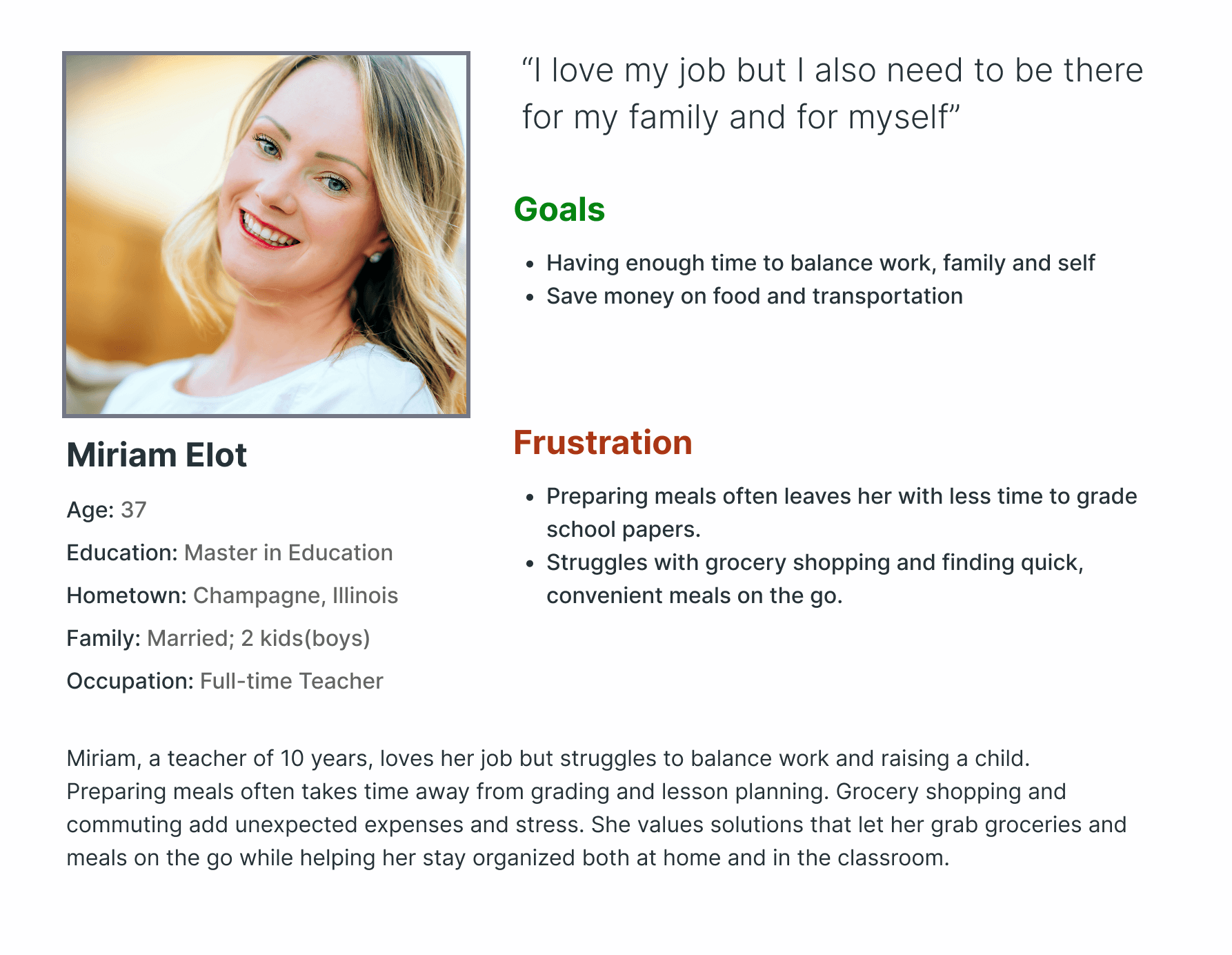
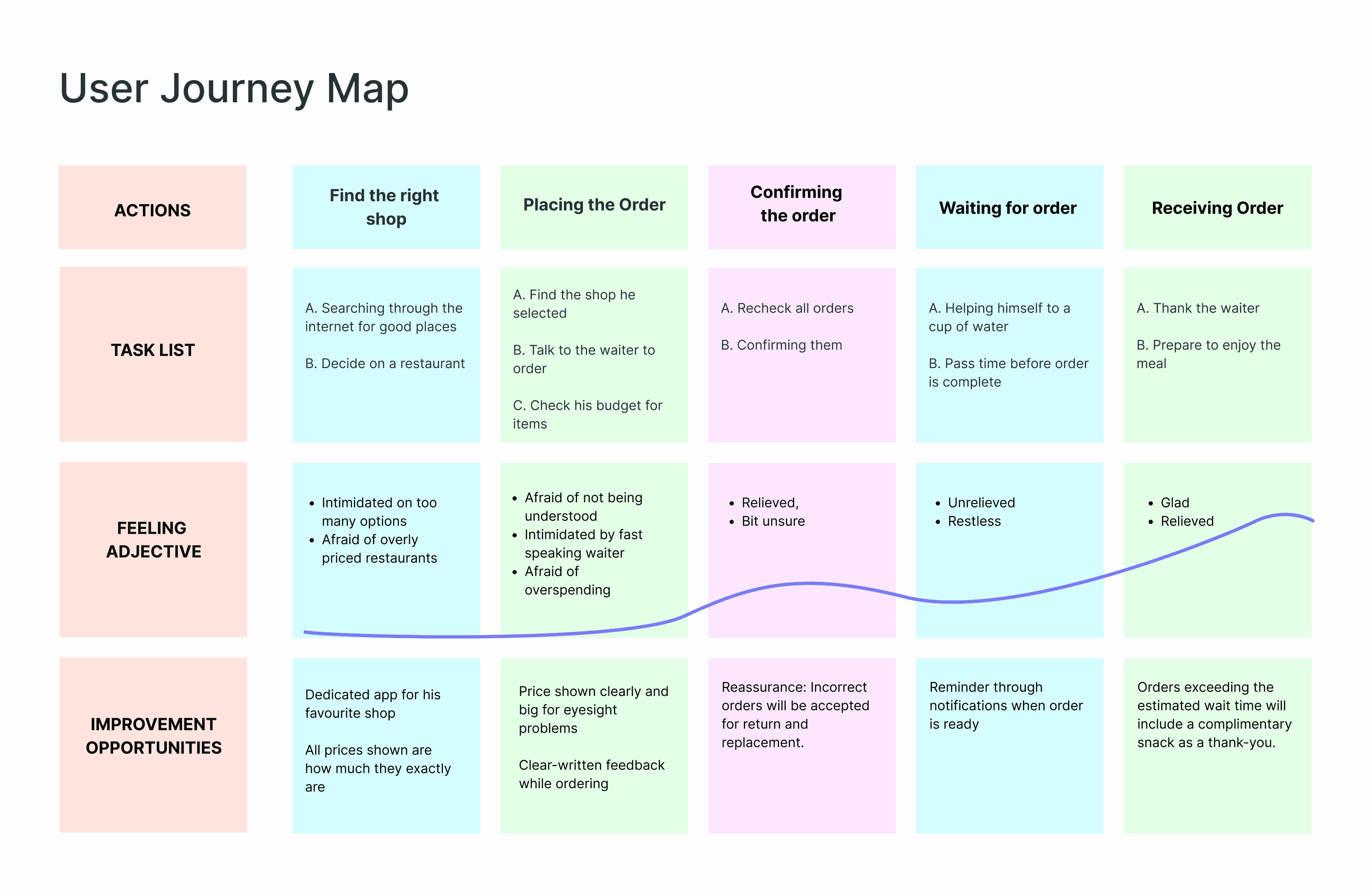
We use simple personas to help us understand our users, and from that we follow through with additional research that is necessary like User testing and Usability studies etc.
At first, we thought our main audience would be busy workers in their mid-30s. But after research, we realized students struggle with time just as much, so we expanded our focus.
1
2
3
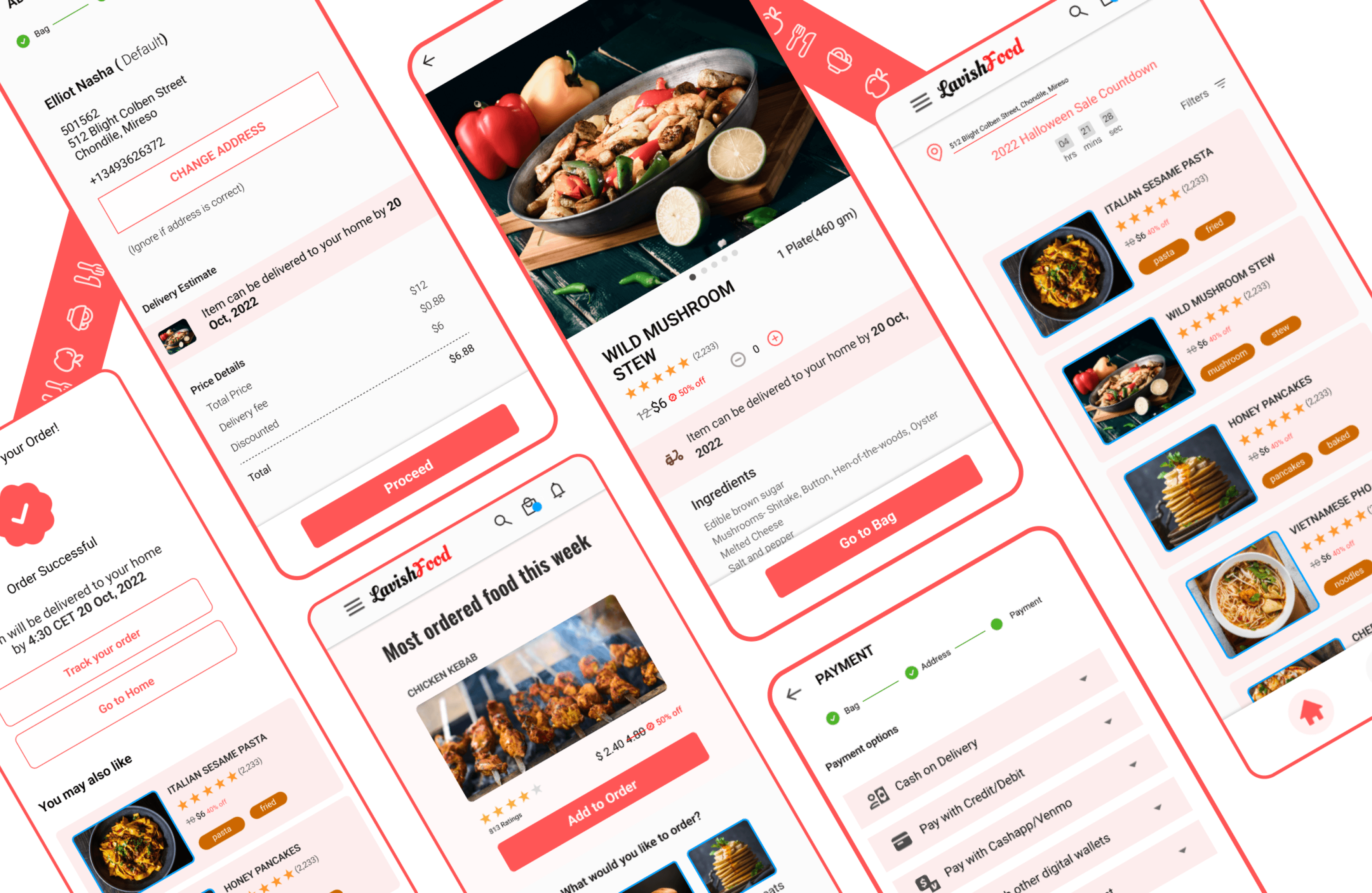
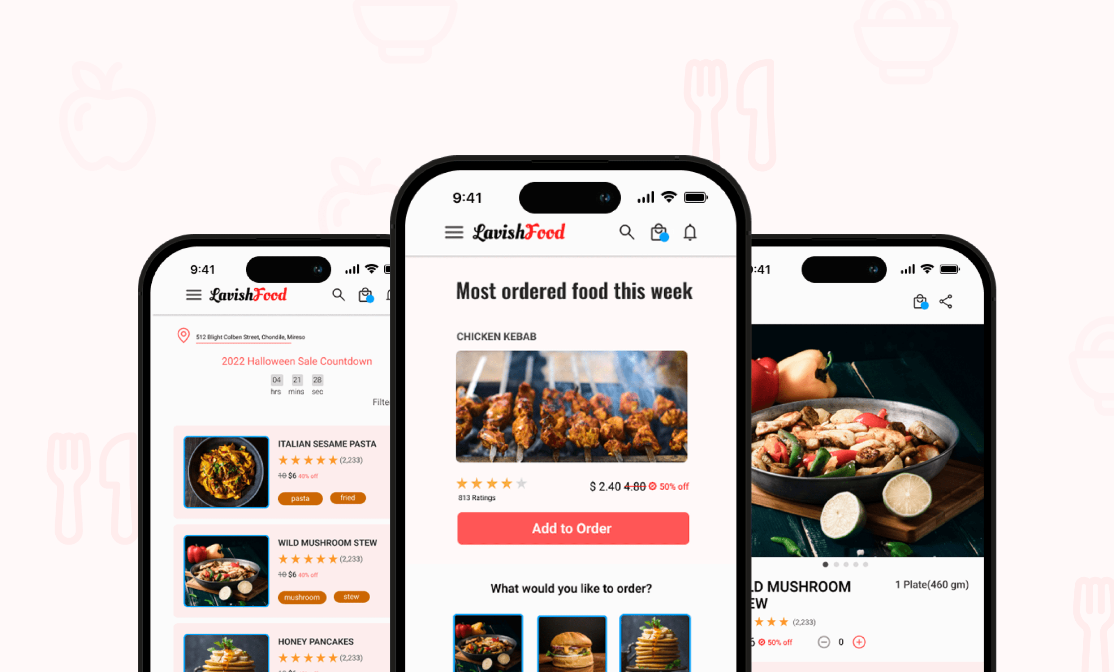
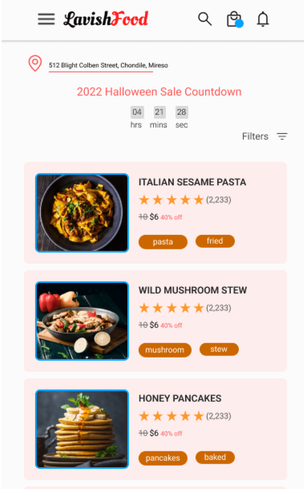
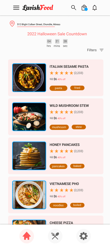
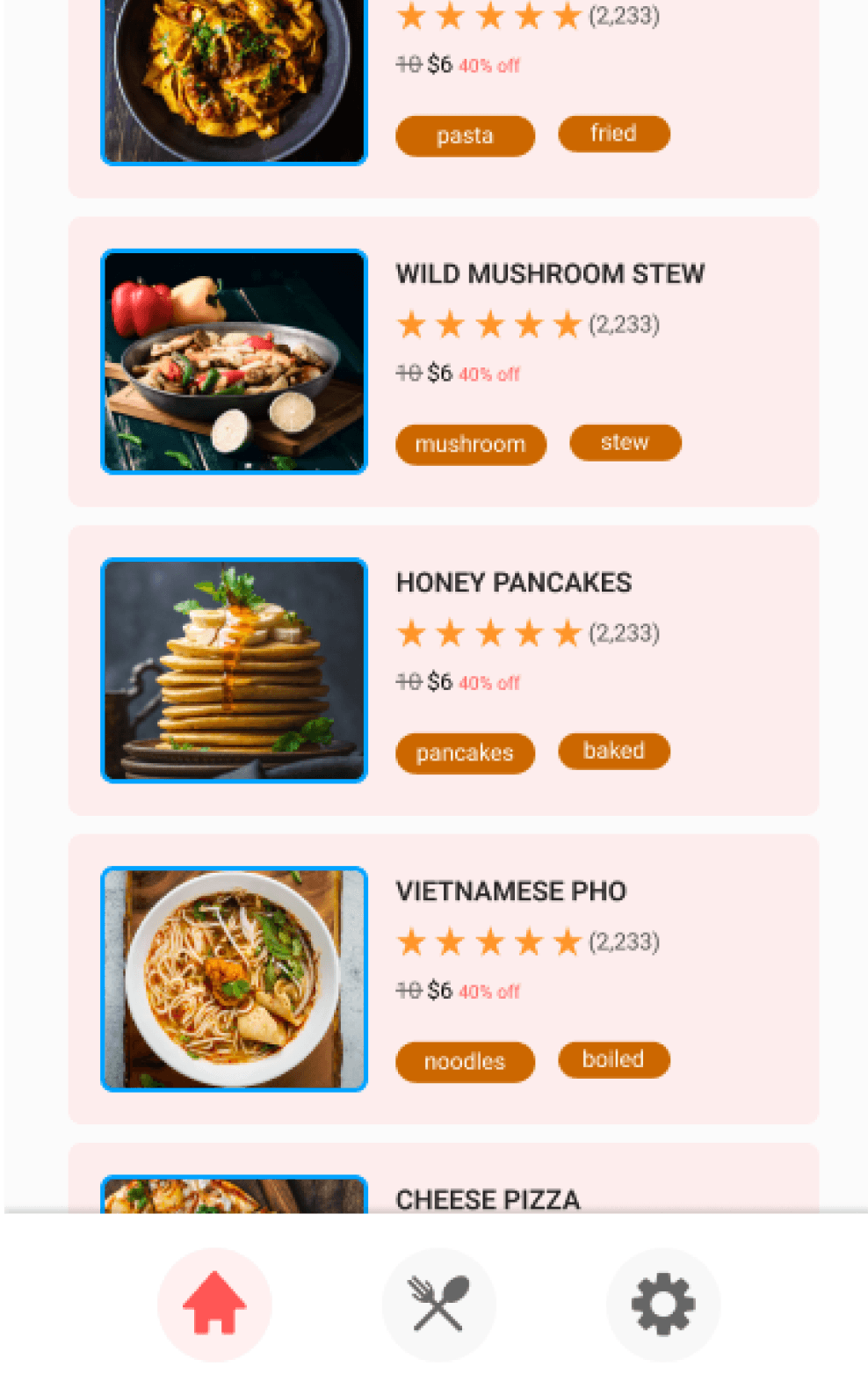
Rapid wireframing techniques were used to quickly visualize and iterate on design ideas, ensuring the app’s layout, features, and user flow were well-structured before moving to high-fidelity designs.
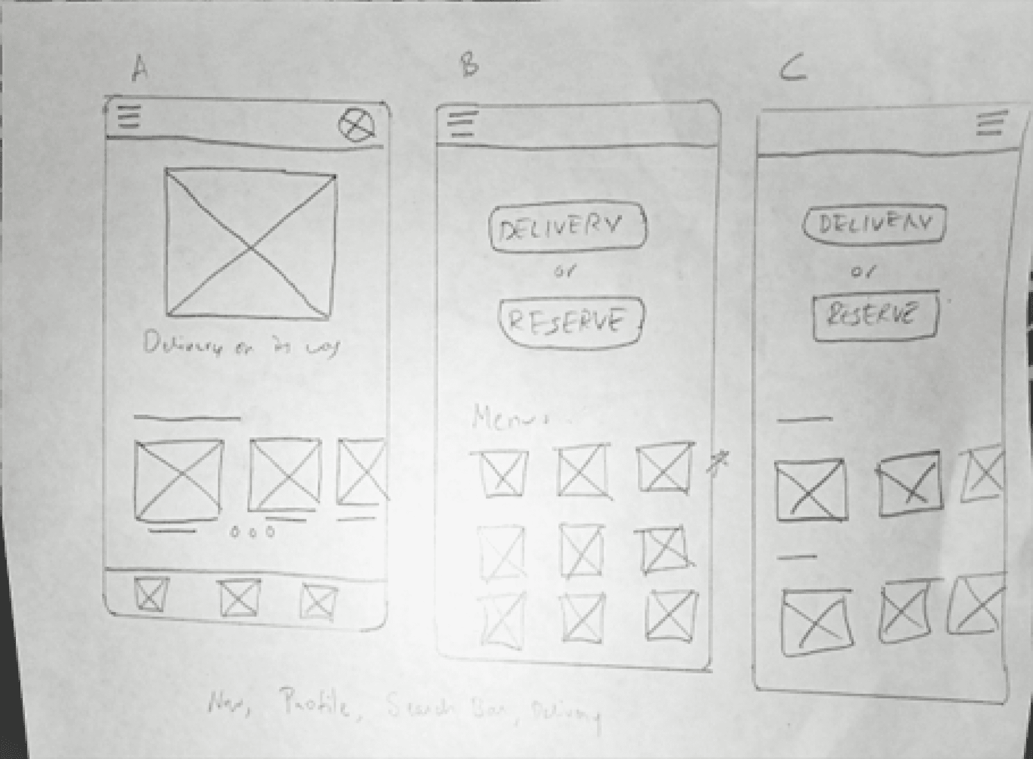
Research and competitive audits were key in shaping the initial wireframes, ensuring the design aligned with user needs and industry standards.

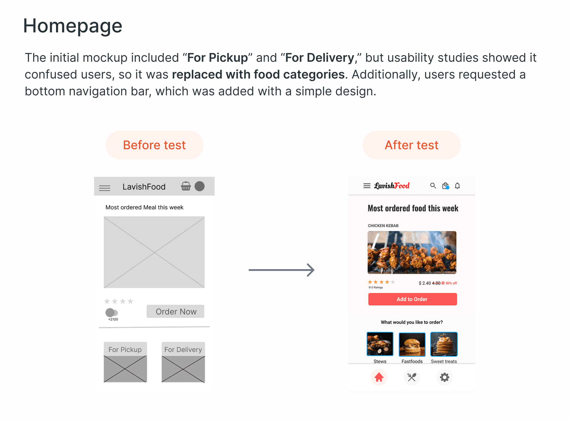
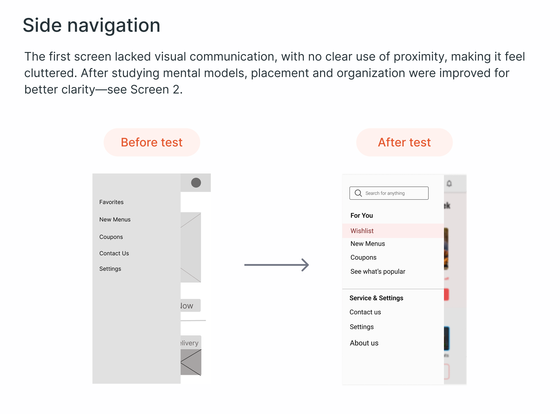
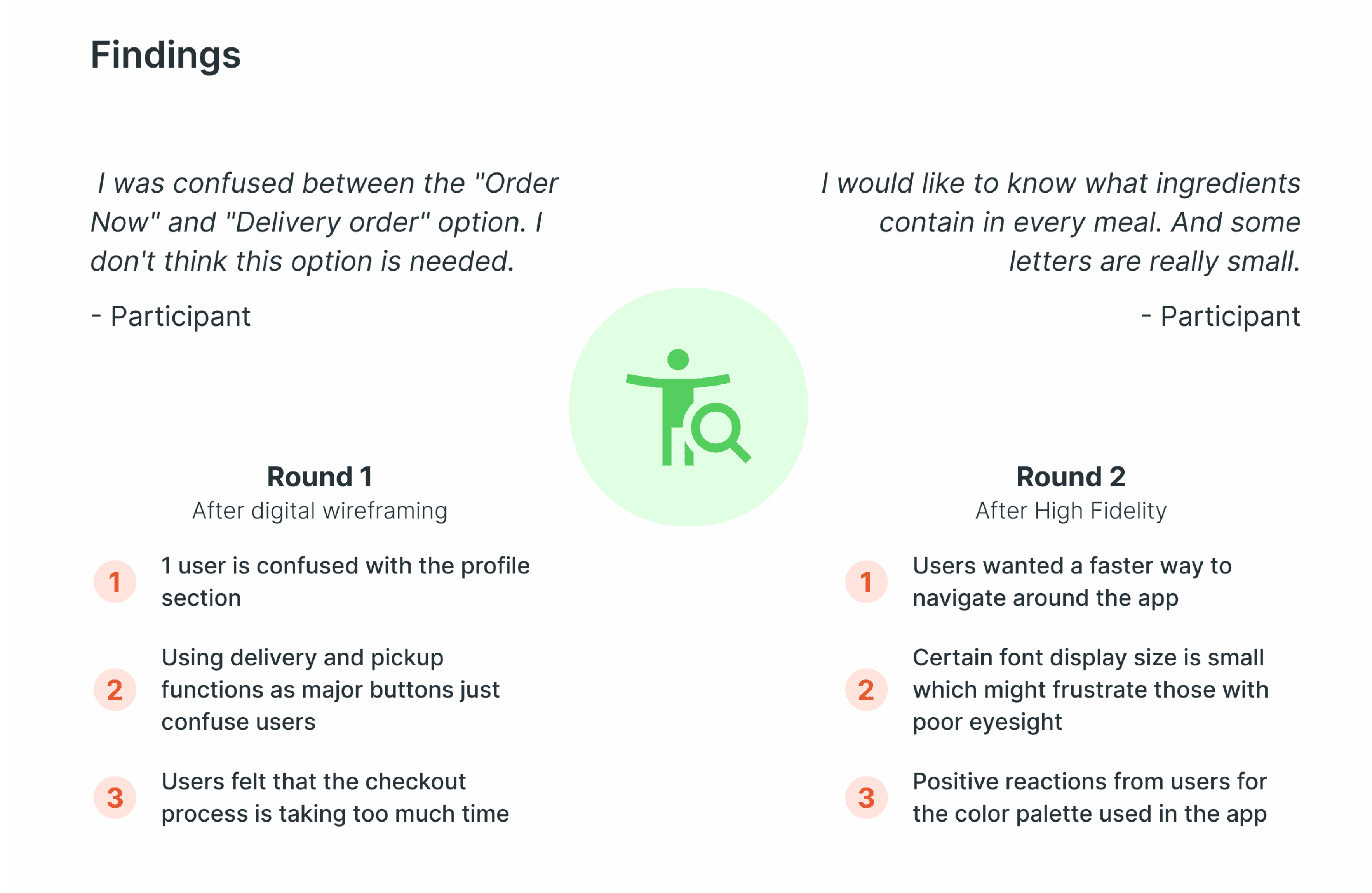
Since wireframes were based on initial hypotheses and assumptions from secondary research, we conducted usability testing twice—first after creating digital wireframes to assess basic usability, and again after developing high-fidelity designs to refine the final experience.
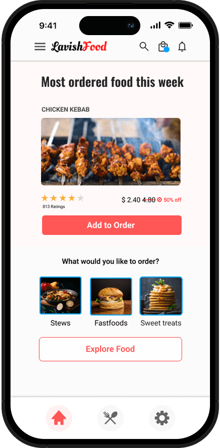
The screens were further refined based on usability testing insights, bringing them closer to the final envisioned mockup.